Claude Design Landing Page That Measures Plan Demand
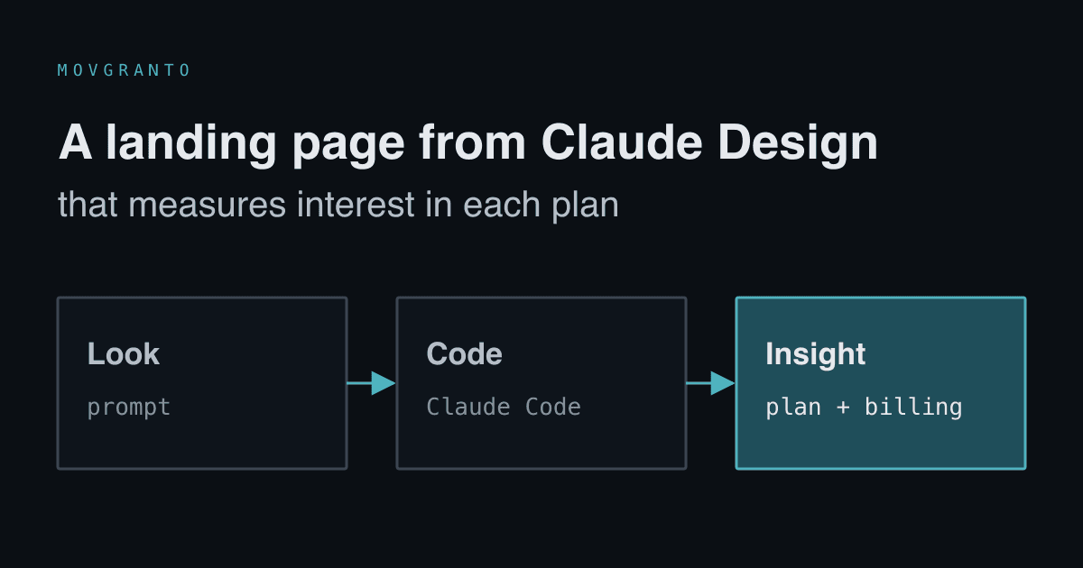
The BusiKM landing page took a few hours: design from a Claude Design prompt, code from Claude Code, and a form that records which plan someone viewed.
Published: 7 min read
Author: Łukasz Głowacz, Full-Stack Engineer · Czytaj po polsku
Contents
The BusiKM landing page took a few hours. Most of that time didn't go into writing code, because I hardly wrote any. It went into desktop and mobile mockups, wiring the form to Firebase, and one business decision: the signup form had to tell us which pricing plan someone clicked before leaving their email. In this post I describe what that process looks like when Claude Design handles the visuals, Claude Code writes the code, and my role is content, rules and decisions.
Three sources, each for a different thing
The whole process rests on one split, written at the top of the rollout docs: the documentation holds the content, Claude Design produces the look, and the landing/ directory is the code. Each of these has a single source, so it's clear where to fix things.
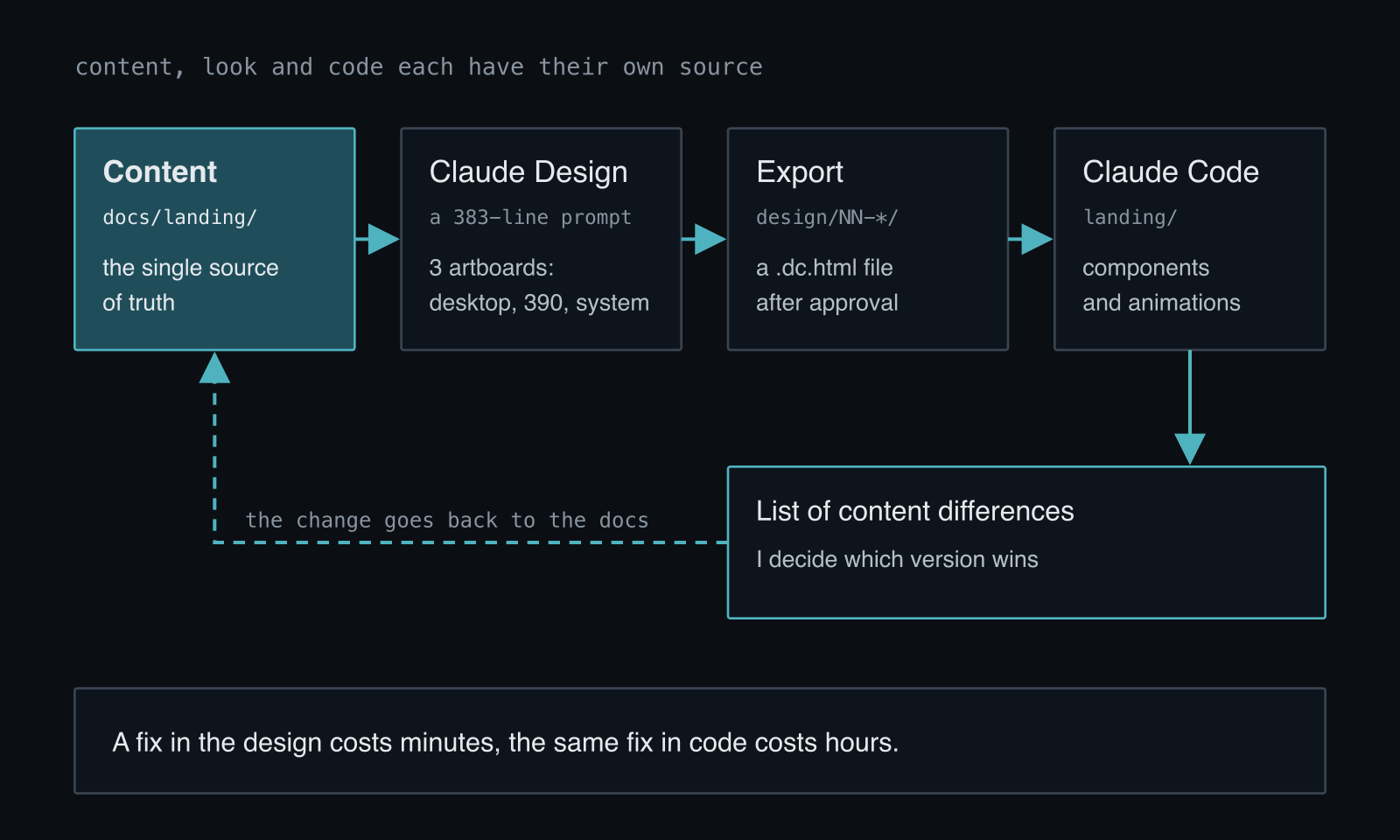
The most important rule: if I change a sentence in Claude Design, it goes back to the documentation first and only then to the code. Without that, after three iterations nobody knows which version of the copy is the real one: the one in the design, the one in the code, or the one in the file. The second rule: we don't implement a page before the design is approved. A fix in the design costs minutes, the same fix in code costs hours.
A prompt that is a specification
The prompt for the home page is 383 lines long and reads more like a spec than a request for a nice-looking page. It describes who will read the page, what the main promise is, the tone, the visual system, and the content of every section with ready-made headings. But the section that teaches the most is "What NOT to do":
- don't invent social proof, because the product has no customers yet: no logos, no testimonials, no numbers like "500 satisfied carriers",
- don't use stock photos, use interface mockups and typography instead,
- don't scare people with a legal deadline, just state the fact and the date,
- don't write in corporate language: "platform", "solution", "ecosystem" and "comprehensive" are banned.
At the end there's a success criterion that helps with every design decision: the owner of a transport company scrolls the page on their phone between one customer call and the next, and after ten seconds knows that this collects data from their drivers and closes the month for them. If they have to read to understand that, the design is too dense.
The prompt requires three artboards: the full page at 1440 px wide, the full page on a phone at 390 px, and a system sheet with colors, typography and components. The third one is the basis for implementation. For the home page there are also navigation states, because without them you'd have to guess what the bar looks like after scrolling and with the menu expanded.
Iterations in Claude Design only work with specific feedback. "Section 7 is too tight, more space above the heading" works. "Make it prettier" doesn't.
From design to code
I export the finished design to the repository, into the design/ directory with the page number. Claude Code compares it with the documentation, lists every content discrepancy, moves the tokens into CSS, assembles the sections into components and hooks up the animations. I get a branch with the code and a short list of discrepancies to decide on. Where a real app screen should be but doesn't exist yet, a frame with the file name stays. Swapping a mockup for a screenshot means dropping in one image.
The subpages went in waves: twenty-four prompts in four waves. A wave didn't wait for the previous one. While Claude Code was implementing the first, I was designing the second. Every PR goes through Lighthouse in CI, on desktop and on mobile. This site, movgranto.com, was built the same way: from a Claude Design project whose export lives in the repository as the source of truth for look and motion.
A form that tells us which plan someone viewed
Neither the app nor the demo was public yet, so instead of buttons leading nowhere, the landing page has two early-access lists. Someone who clicked "See the demo" ends up on a different list than someone who clicked "Log in", because the latter was looking for their own account and is closer to a decision. The first message to these two groups shouldn't sound the same.
The first version, however, lost the most valuable piece of information. Someone who clicked "Try for 14 days" on the Company plan with annual billing told us more about themselves than just an email address, yet the button led to the signup page with no trace of what they had been looking at. The submissions in the inbox were indistinguishable.
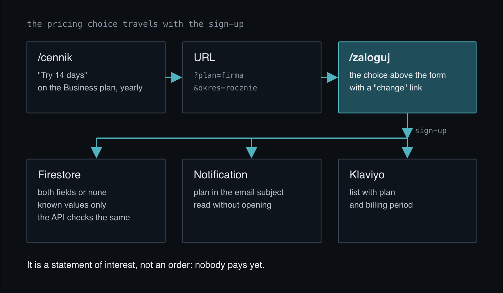
Now the plan and period travel in the page URL, and after signup they end up in the database, in the email notification and in the mailing list. The plan is in the email subject, so a submission can be assessed without opening it. The calculator in the pricing page works the same way and passes the plan the slider arrived at. This way we see which plan attracts people more, before the product even has payments.
Two decisions in this mechanism mattered more than the code itself. First: the choice is shown above the form, with a "change" link, rather than passed along silently. The person sees their choice wasn't lost and can correct it, and we don't collect anything in the background that we wouldn't show them openly. Second: this is a declaration of interest, not an order. Nobody pays yet, so the fields are optional all the way through, because people also reach the signup page straight from a search engine.
Firestore rules make sure these fields don't become a place for arbitrary text from outside:
// Plan and billing period from the pricing page. Optional, because people
// also land on the sign-up page directly. If present: both at once, known values only.
function wyborZCennika(d) {
  return ('plan' in d) == ('okres' in d)
    && (!('plan' in d)
        || (d.plan in ['start', 'firma']
            && d.okres in ['miesiecznie', 'rocznie']));
}
The API route that handles the signup repeats the same validation, because it's public and can't assume our form called it.
What remains
A few hours for a landing page isn't down to AI writing code fast. It's down to the split: content in one place, a design approved before code, and a clear list of discrepancies to decide on. Most of my work went into things no tool will do for me: what the page should promise, what it shouldn't pretend, and what it should learn from visitors.
So before you design a landing page, decide what it should measure. For us it was one piece of information: which plan someone viewed before signing up. The fourteen-day trial from the pricing page also has its ending in code, which I described in the post about read-only mode. If you're building a landing page for your SaaS and want to do it this way, write to me.