Too many MVP features: fixing the first 10 minutes
My BusiKM MVP had too many features and new users got lost. Instead of adding modules, I fixed the first 10 minutes: checklist, menu, empty states, demo.
Published: 6 min read
Author: Łukasz Głowacz, Full-Stack Engineer · Czytaj po polsku
Contents
While building BusiKM, I put too many features into the MVP and the app became hard for users to make sense of. I had to design a second version that was much clearer. The interesting part of this story, though, is that the problem was not the interface of any individual screen. The problem was what a new business owner sees in the first ten minutes after creating an account. This post is about how I diagnosed it and what I changed while adding almost no new features.
Diagnosis: not a bad interface, but missing first minutes
In August I ran an audit of the whole product. One of its conclusions went roughly like this: the app is not unintuitive because the screens are badly designed, but because nobody designed the first ten minutes. The audit traced exactly what a new owner sees:
- the financial dashboard with receivables cards, KPIs with targets, a revenue chart and a forecast. Without data it is a wall of zeros and dashes, plus jargon like "linear extrapolation",
- the new order wizard with five steps, which at the very start requires picking a sender, a recipient and a payer from the list of contractors. On a fresh account that list is empty, so the wizard ends in a dead end,
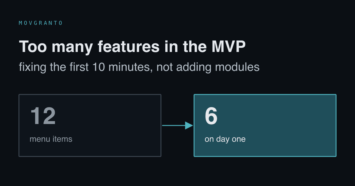
- navigation with 12 menu items for the owner, 16 items in settings and eight tabs on the order details,
- empty lists saying "No data" instead of explaining what the list is for and how to fill it.
Each of these screens on its own was fine for someone already working in the system. Together they made a product in which a new person had no idea where to start.
Five changes, ordered by return
The fix plan did not add modules. It changed the order in which the user discovers what was already there:
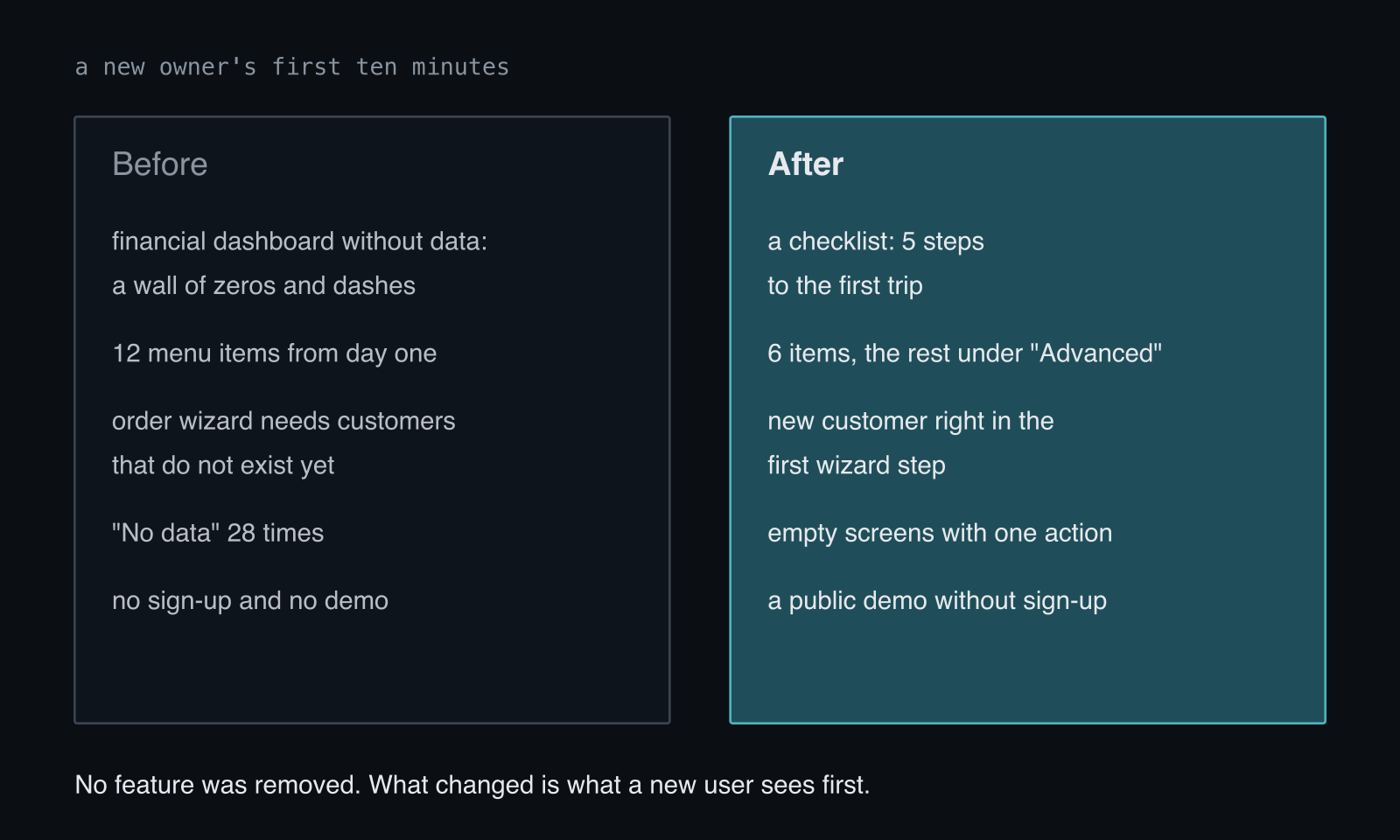
First-run checklist. Above the owner's dashboard there is now a "Getting started" card with five steps: complete company details, add the first vehicle, invite a driver, the driver logs into the app, the first route appears here. Only the first incomplete step has a button, so the owner does not get five calls to action at once. The backend checks the steps against data, not clicks, so you can't tick off the card without actually doing the step. After the last step the card disappears.
Progressive disclosure in navigation. A fresh account starts with six items: dashboard, orders, invoices, costs, fleet and drivers. That is everything needed for the first route and the first invoice. Reports, dispatch, contractors, documents, driver working time and users wait in a collapsed "Advanced" section. Nothing is locked, and the section opens with one click. After the first closed route and the first invoice, the items return to their usual places.
Contractor in the first step of the wizard. Under the sender, recipient and payer fields there is now a "New…" option that opens a short form without leaving the wizard. A single save can set both the sender and the recipient at once. The dead end is gone.
Empty screens that say what's next. Instead of "No data", every empty screen has an icon, one sentence about what it is for, and one action. All 28 bare "No data" strings in the panel code were replaced with sentences saying when data will appear, for example "The forecast will appear after the first completed order". An empty list with an active filter still says "no results", because "add your first vehicle" would be untrue there.
Public demo without sign-up. The login page has a button leading to a demo where you can view the company through the eyes of an owner, an accountant or a dispatcher. The demo runs in read-only mode, so a visitor sees the full product with data but can't break anything.
The activation definition, written in code
The most important decision in this change is hidden in the last step of the checklist: the first closed route. That is my definition of activation, the moment when a company gets its first real value from BusiKM: data from the driver landed in the system without the company's involvement.
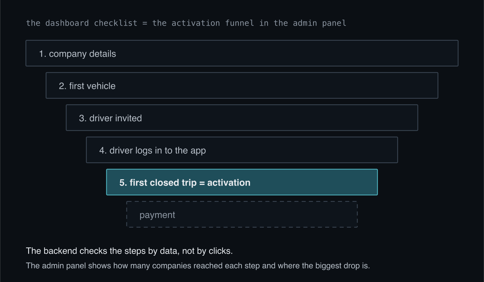
The same steps the owner sees as a checklist, I see in the admin panel as a funnel. For each cohort of companies registered in a given period, the panel shows how many reached each step, the drop-off between steps, the median days to the first route, and the step with the biggest drop-off. So one list of steps serves two purposes: it guides the user and measures where the product loses them.
What I didn't do
I had also been recording video tutorials on YouTube and wondered whether to continue. The audit advised against it for three reasons, and I agree with them. A video tutorial is a symptom of UX debt, not a cure: if you need to record a video on how to add a vehicle, the problem is in the add-vehicle form. Videos are hard to maintain when the interface changes every week, and an outdated tutorial is worse than none. And finally, a text help center gets indexed by Google, while a video does not.
I also didn't add any new module to "balance out" the feeling of overload. Some features did drop out of the product on another occasion, which I wrote about in the post on what we don't build. This time the goal was different: keep the features, but change what a new user sees first.
The lesson
An MVP with too many features is a common mistake, because each feature has a justification on its own. The cure is not always cutting. Often it is enough to decide what the first value is that the customer should get, lead them to it by the shortest path, and hide the rest until they need it. And then measure where they drop off along the way.
If your SaaS also looks good to someone who already knows it, while new users get lost in it, write to me.